Text Layout Configuration
In RegexBuddy, a “text layout” is a combination of settings that control how text is displayed and how the text cursor navigates through that text. The settings include the font, text direction, text cursor behavior, text cursor appearance, which characters are word characters, and how the text should be spaced.
On the Editors tab in the Preferences, you can select up to four different text layouts that are used for various parts of RegexBuddy. The Regex text layout is used for edit boxes for regular expressions and replacement texts. The Convert text layout is used for the warning and error messages on the Convert panel. The font from the Convert text layout is also used for the regex tree on the Create panel. The editors on the Test, Debug, Use, and GREP panels all use the same text layout. You’ll likely want to select a monospaced text layout for this one, so that columns line up correctly. The Forum text layout is used to edit messages on the built-in user forum.
You can select predefined text layouts from the drop-down lists. Or, you can click the Configure Text Layouts button to show the Text Layout Configuration window to customize the text layouts.
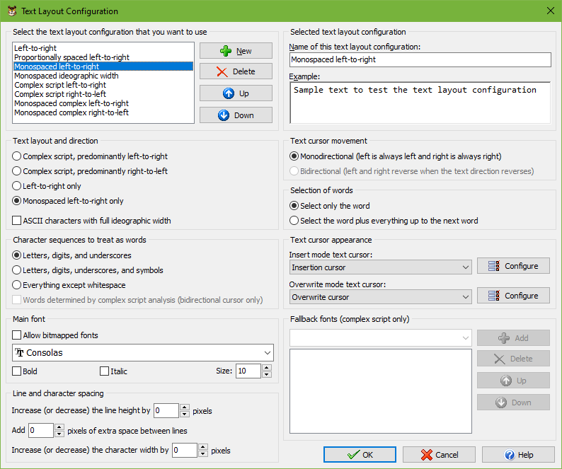
Select The Text Layout Configuration That You Want to Use
The Text Layout Configuration screen shows the details of the text layout configuration that you select in the list in the top left corner. Any changes you make on the screen are automatically applied to the selected layout and persist as you choose different layouts in the list. The changes become permanent when you click OK. The layout that is selected in the list when you click OK becomes the new default layout.
Click the New and Delete buttons to add or remove layouts. You must have at least one text layout configuration. If you have more than one, you can use the Up and Down buttons to change their order. The order does not affect anything other than the order in which the text layouts configurations appear in selection lists.
RegexBuddy comes with a number of preconfigured text layouts. If you find the options on this screen bewildering, simply choose the preconfigured layout that matches your needs, and ignore all the other settings. You can fully edit and delete all the preconfigured text layouts if you don’t like them.
- Left-to-right: Normal settings with best performance for editing text in European languages and ideographic languages (Chinese, Japanese, Korean). The default font is monospaced. The layout does respect individual character width if the font is not purely monospaced or if you select another font.
- Proportionally spaced left-to-right: Like left-to-right, but the default font is proportionally spaced.
- Monospaced left-to-right: Like left-to-right, but the text is forced to be monospaced. Columns are guaranteed to line up perfectly even if the font is not purely monospaced. This is the best choice for working with source code and text files with tabular data.
- Monospaced ideographic width: Like monospaced left-to-right, but ASCII characters are given the same width as ideographs. This is the best choice if you want columns of mixed ASCII and ideographic text to line up perfectly.
- Complex script left-to-right: Supports text in any language, including complex scripts (e.g. Indic scripts) and right-to-left scripts (Hebrew, Arabic). Choose this for editing text that is written from left-to-right, perhaps mixed with an occasional word or phrase written from right-to-left.
- Complex script right-to-left: For writing text in scripts such as Hebrew or Arabic that are written from right-to-left, perhaps mixed with an occasional word or phrase written from left-to-right.
- Monospaced complex left-to-right: Like “complex script left-to-right”, but using monospaced fonts for as many scripts as possible. Text is not forced to be monospaced, so columns may not line up perfectly.
- Monospaced complex right-to-left: Like “complex script right-to-left”, but using monospaced fonts for as many scripts as possible. Text is not forced to be monospaced, so columns may not line up perfectly.
Selected Text Layout Configuration
The section in the upper right corner provides a box to type in the name of the text layout configuration. This name is only used to help you identify it in selection lists when you have prepared more than one text layout configuration.
In the Example box you can type in some text to see how the selected text layout configuration causes the editor to behave.
Text Layout and Direction
- Complex script, predominantly left-to-right: Text is written from left to right and can be mixed with text written from right to left. Choose this for complex scripts such as the Indic scripts, or for text in any language that mixes in the occasional word or phrase in a right-to-left or complex script.
- Complex script, predominantly right-to-left: Text is written from right to left and can be mixed with text written from left to right. Choose this for writing text in scripts written from right to left such as Hebrew or Arabic.
- Left-to-right only: Text is always written from left to right. Complex scripts and right-to-left scripts are not supported. Choose this for best performance for editing text in European languages and ideographic languages (Chinese, Japanese, Korean) that is written from left to right without exception.
- Monospaced left-to-right only: Text is always written from left to right and is forced to be monospaced. Complex scripts and right-to-left scripts are not supported. Each character is given the same horizontal width even if the font specifies different widths for different characters. This guarantees columns to be lined up perfectly. To keep the text readable, you should choose a monospaced font.
- ASCII characters with full ideographic width: You can choose this option in combination with any of the four preceding options. In most fonts, ASCII characters (English letters, digits, and punctuation) are about half the width of ideographs. This option substitutes full-width characters for the ASCII characters so they are the same width as ideographs. If you turn this on in combination with “monospaced left-to-right only” then columns that mix English letters and digits with ideographs will line up perfectly.
Text Cursor Movement
- Monodirectional: The left arrow key on the keyboard always moves the cursor to the left on the screen and the right arrow key always moves the cursor to the right on the screen, regardless of the predominant or actual text direction.
- Bidirectional: This option is only available if you have chosen one of the complex script options in the “text layout and direction” list. The direction that the left and right arrow keys move the cursor into depends on the predominant text direction selected in the “text layout and direction” list and on the actual text direction of the word that the cursor is pointing to when you press the left or right arrow key on the keyboard.
- Predominantly left-to-right: The left key moves to the preceding character in logical order, and the right key moves to the following character in logical order.
- Actual left-to-right: The left key moves left, and the right key moves right.
- Actual right-to-left: The actual direction is reversed from the predominant direction. The left key moves right, and the right key moves left.
- Predominantly right-to-left: The left key moves to the following character in logical order, and the right key moves to the preceding character in logical order.
- Actual left-to-right: The actual direction is reversed from the predominant direction. The left key moves right, and the right key moves left.
- Actual right-to-left: The left key moves left, and the right key moves right.
Selection of Words
- Select only the word: Pressing Ctrl+Shift+Right moves the cursor to the end of the word that the cursor is on. The selection stops at the end of the word. This is the default behavior for all Just Great Software applications. It makes it easy to select a specific word or string of words without any extraneous spaces or characters. To include the space after the last word, press Ctrl+Shift+Right once more, and then Ctrl+Shift+Left.
- Select the word plus everything to the next word: Pressing Ctrl+Shift+Right moves the cursor to the start of the word after the one that the cursor is on. The selection includes the word that the cursor was on and the non-word characters between that word and the next word that the cursor is moved to. This is how text editors usually behave on the Windows platform.
Character Sequences to Treat as words
- Letters, digits, and underscores: Characters that are considered to be letters, digits, or underscores by the Unicode standard are selected when you double-click them. Ctrl+Left and Ctrl+Right move the cursor to the start of the preceding or following sequence of letters, digits, or underscores. If symbols or punctuation appear adjacent to the start of a word, the cursor is positioned between the symbol and the first letter of the word. Ideographs are considered to be letters.
- Letters, digits, and symbols: As above, but symbols other than punctuation are included in the selection when double-clicking. Ctrl+Left and Ctrl+Right never put the cursor between a symbol and another word character.
- Everything except whitespace: All characters except whitespace are selected when you double-click them. Ctrl+Left and Ctrl+Right move the cursor to the preceding or following position that has a whitespace character to the left of the cursor and a non-whitespace character to the right of the cursor.
- Words determined by complex script analysis: If you selected the “bidirectional” text cursor movement option, you can turn on this option to allow Ctrl+Left and Ctrl+Right to place the cursor between two letters for languages such as Thai that don’t write spaces between words.
Text Cursor Appearance
Select a predefined cursor or click the Configure button to show the text cursor configuration screen. There you can configure the looks of the blinking text cursor (and even make it stop blinking).
A text layout uses two cursors. One cursor is used for insert mode, where typing in text pushes ahead the text after the cursor. The other cursor is used for overwrite mode, where tying in text replaces the characters after the cursor. Pressing the Insert key on the keyboard toggles between insert and overwrite mode.
Main Font
Select the font that you want to use from the drop-down list. Turn on “allow bitmapped fonts” to include bitmapped fonts in the list. Otherwise, only TrueType and OpenType fonts are included. Using a TrueType or OpenType font is recommended. Bitmapped fonts may not be displayed perfectly (e.g. italics may be clipped) and only support a few specific sizes.
If you access the text layout configuration screen from the print preview, then turning on “allow bitmapped fonts” will include printer fonts rather than screen fonts in the list, in addition to the TrueType and OpenType fonts that work everywhere. A “printer font” is a font built into your printer’s hardware. If you select a printer font, set “text layout and direction” to “left to right only” for best results.
Fallback Fonts
Not all fonts are capable of displaying text in all scripts or languages. If you have selected one of the complex script options in the “text layout and direction” list, you can specify one or more “fallback” fonts. If the main font does not support a particular script, RegexBuddy will try to use one of the fallback fonts. It starts with the topmost font at the list and continues to attempt fonts lower in the list until it finds a font that supports the script you are typing with. If none of the fonts supports the script, then the text will appear as squares.
To figure out which scripts a particular font supports, first type or paste some text using those scripts into the Example box. Make sure one of the complex script options is selected. Then remove all fallback fonts. Now you can change the main font and see which characters that font can display. When you’ve come up with a list of fonts that, if used together, can display all of your characters, select your preferred font as the main font. Then add all the others as fallback fonts.
Line and Character Spacing
By default all the spacing options are set to zero. This tells RegexBuddy to use the default spacing for the font you have selected.
If you find that lines are spaced apart too widely, specify a negative value for “increase (or decrease) the line height”. Set to “add 0 pixels of extra space between lines”.
If you find that lines are spaced too closely together, specify a positive value for “increase (or decrease) the line height” and/or “add ... pixels of extra space between lines”. The difference between the two is that when you select a line of text, increasing the line height increases the height of the selection highlighting, while adding extra space between lines does not. If you select multiple lines of text, extra space between lines shows up as gaps between the selected lines. Adding extra space between lines may make it easier to distinguish between lines.
The “increase (or decrease) the character width by ... pixels” setting is only used when you select “monospaced left-to-right” only in the “text layout and direction” list. You can specify a positive value to increase the character or column width, or a negative value to decrease it. This can be useful if your chosen font is not perfectly monospaced and because of that characters appear spaced too widely or too closely.